Editorial Note: This article was written by the KZHAA Digital Team to document the foundation's brand transformation. It reflects the views and decisions of KZHAA leadership and is intended to inform our community, donors, and partners. A full detailed proposal is available for download below.
After more than 4 years of faithful service under the same banner, the Kumasi Zongo Home & Abroad Unity Foundation has taken a bold step forward — retiring its original logo and visual identity in favour of a comprehensive new brand system built for the digital age.
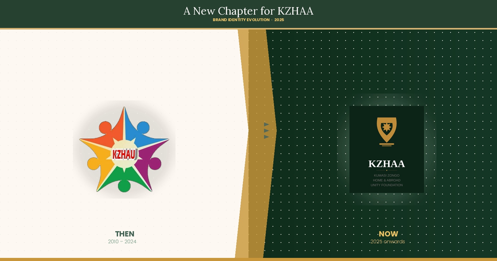
Where We Started
The original KZHAA logo — a colourful circular mark featuring six figures joined in unity around a central star — was created in the early days of the foundation. It served its purpose well: it was vibrant, community-spirited, and instantly communicated togetherness. For its time, it was exactly right.
But the world has changed. Over 4 years, KZHAA has grown from a small community group into a registered foundation managing active projects, receiving online donations from Ghana and the diaspora, running events across Kumasi, and communicating with thousands of members via WhatsApp, social media, and now a full digital platform. The old identity — designed for print flyers and banners — was not built for this scale.
What Was Not Working
The honest assessment was difficult to ignore. The old logo used multiple bright colours that made it impossible to reproduce cleanly at small sizes — on a browser tab, a WhatsApp profile picture, or a document header, the design became unclear. There was no consistent colour palette, no defined typography, and no visual system that could carry the KZHAA identity coherently across a website, a donation receipt, a certificate, and a social media post.
The website itself reflected the same gaps. It was not mobile-responsive at a time when over 78% of web traffic in Ghana originates from mobile devices. The donation system was fragile, with no confirmation emails or SMS receipts. There was no admin panel, meaning content updates required direct server access. And there was nothing on the site that communicated the seriousness and professionalism of an organisation that has now raised hundreds of thousands of cedis for its community.
The New Identity — Every Decision Had a Reason
The Logo
The new KZHAA logomark fuses three elements with deliberate meaning. The shield carries connotations of protection and civic pride — qualities central to what KZHAA does for the Zongo community. The eight-pointed star, the Rub el Hizb, is one of the most recognisable symbols in Islamic tradition, woven through centuries of Islamic art and architecture. Its presence places KZHAA's faith identity at the visual centre of the brand, not as an afterthought. And the location pin, integrated into the base of the shield, anchors the entire mark to a specific place — Kumasi, the Zongo community, Ghana — while also speaking to diaspora members who carry their roots wherever they go.
The Colours
The palette was not chosen by aesthetics alone. The deep forest greens — FOREST through to GREEEN — draw from the primary colour of Islam, the Ghanaian landscape, and the visual language of growth and rootedness. Green also communicates institutional trust, an essential quality for a charitable organisation asking people to donate money.
The gold — GOLD — references both the Islamic tradition of divine light and the Ashanti goldfields that made Kumasi the cultural capital it is today. Practically, it was selected because it achieves WCAG AA accessibility contrast on dark green backgrounds, meaning it is both symbolically resonant and readable for everyone.
The cream background CREAM replaces clinical white, reducing glare for users viewing the site on mobile phones in bright sunlight — a very common scenario in Ghana.
The Typography
Playfair Display was chosen for headings — a classical serif typeface that suggests heritage, scholarship, and institutional weight. DM Sans handles body text and UI elements — a modern geometric sans-serif designed specifically for digital interfaces at any resolution. The pairing mirrors KZHAA itself: an organisation with deep traditional roots that operates confidently in the contemporary world.
The New Website
The platform rebuild is as significant as the visual rebrand. The new site, delivers features that simply did not exist before:
- A fully responsive layout that works on every screen size, from a small Android phone to a widescreen desktop
- A live donation system with automatic email and SMS confirmations to donors
- A complete admin CMS allowing KZHAA staff to manage all content — events, projects, blog posts, gallery, volunteers, and testimonials — without any technical knowledge
- A custom thank-you page after every donation, celebrating the donor's generosity with their name, amount, and transaction reference
- An admin notification system that alerts the team in real time when donations are received or volunteer applications are submitted
The old site required a developer for every update. The new platform gives the team full autonomy.
What Stays the Same
The name. The mission. The people. The deep commitment to uplifting Zongo communities through compassion, justice, and sustainable development. The rebrand changes how KZHAA presents itself to the world — not what KZHAA is. The foundation's values, its faith-centred approach, and its rootedness in Kumasi remain unchanged.
This is not a departure from the community. It is an investment in it — an acknowledgement that the people of the Zongo community and the diaspora deserve a digital home that reflects the seriousness and quality of the work being done on the ground every day.
A Word from the Team
"KZHAA has always been worthy of a world-class digital presence. This rebrand is not vanity — it is accountability to the community we serve and the donors who trust us with their generosity."
We are proud to share this new identity with our community. Taqabbalallahu Minna wa Minkum — may Allah accept this work from us and from you.
Download the complete 7-section proposal document — covering the logo rationale, colour system, typography, website architecture, and user experience decisions.